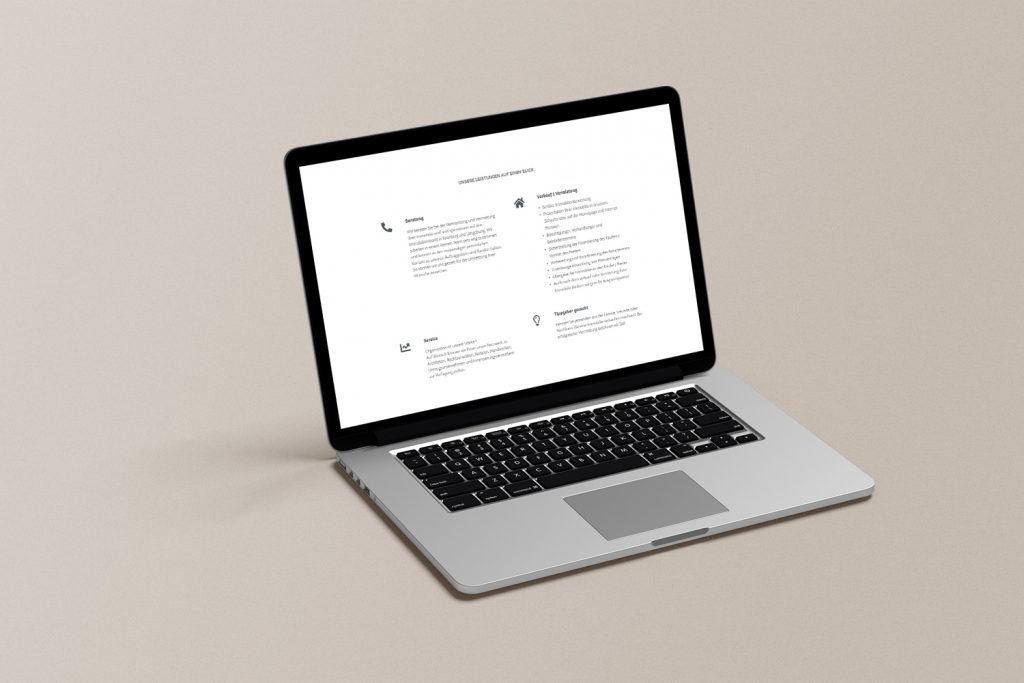
In this project, we reduced the abuse of graphics as much as possible and focused on arranging the letters so that only necessary information could be found intuitively.
As site colors, we only used a dark blue color that matches the logo, and black and white.
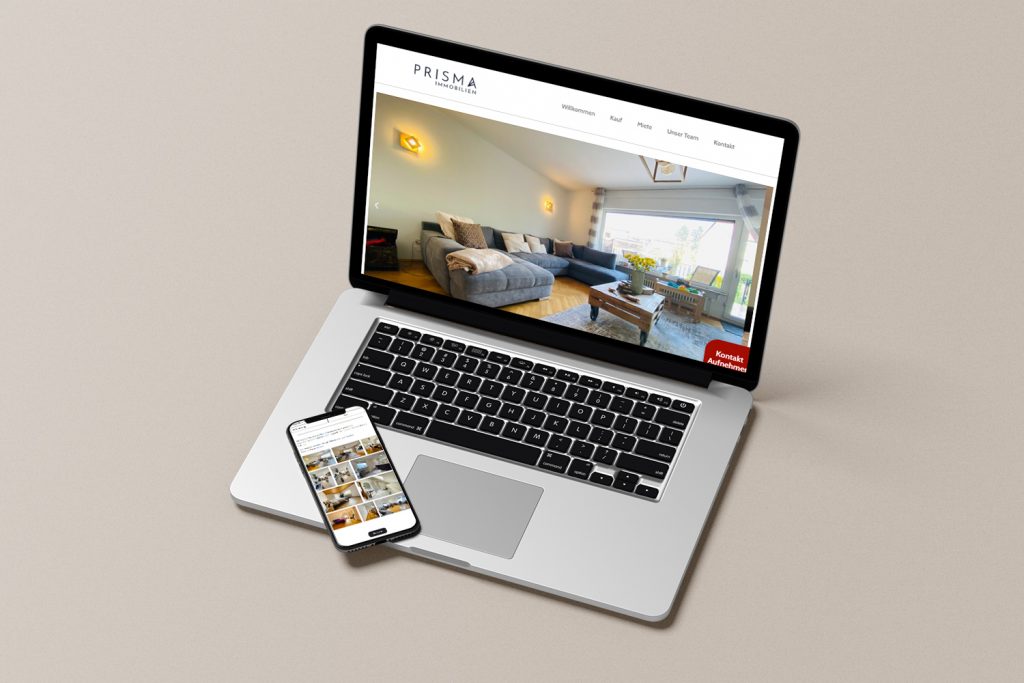
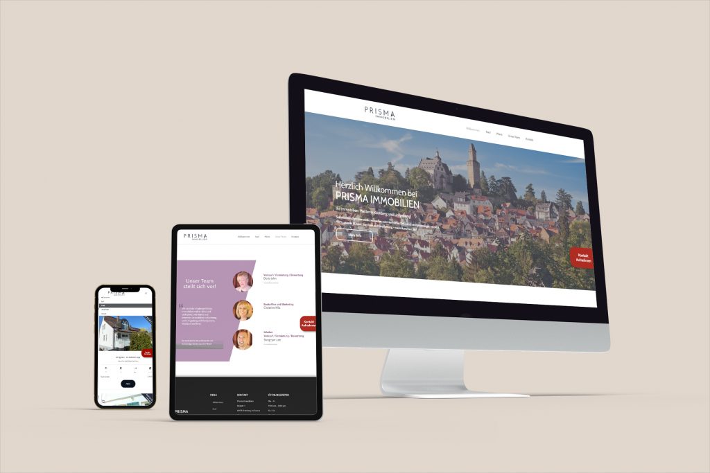
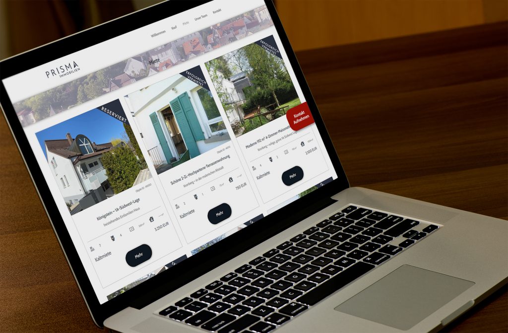
We have implemented a design for multiple devices in advance.
After finishing the detailed design, we can proceed to successful development step by step.